
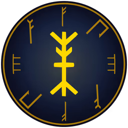
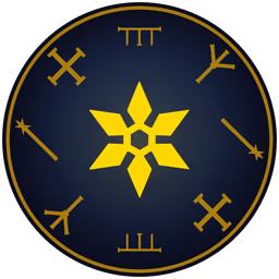
Cast a ward and the circle burned into the ground is written in your faction's own script. Dwarf runes are dead-straight chisel cuts with square ends and mitred corners. Ratmen claw-runes are thin wiry scratches that overshoot every crossing. Kethraki glyphs are thick stone bars dressed with squared meander frets. Nine factions, nine hands, and the letters around the ring say something: each spell writes its own word, so a rune ward and a crystal ward are different inscriptions even cast by the same shaman.
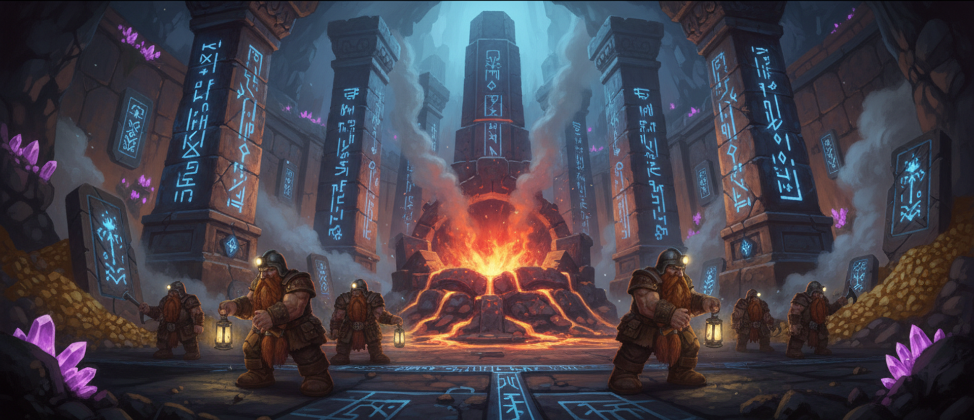
Until August every one of those was the same circle. Ground zones, wards and summoning circles were procedural rings of noise, identical across all nine factions and every school of magic, so a dwarf rune ward and a Kethraki consecration differed only in colour. Adam's point when he raised it was about attention rather than art: these are the effects players look at longest, because they sit on the ground while everything else flashes past. Spending the whole art budget on the flash and none of it on the thing that stays is backwards.
The replacement is a written alphabet per faction. Nine hands writing the same ten letters, 90 glyphs in total, generated as images by Gemini, then traced to vector and shipped as drawable path data, the same way an icon font ships.
That middle step is the one worth explaining, because it is what makes generated art usable at every size. An image model returns a raster: a fixed grid of pixels, sharp at the size it was generated and soft at any other. Tracing converts that grid into an outline — a list of curves describing the edge of the ink, with no resolution of its own. The result is drawn crisply at 12 pixels or 1,200, which matters here because these letters are drawn into small spell textures, around ground rune rings in 3D, and into a 2D canvas at any zoom the player picks. A raster would have to be authored for the largest of those and would still be soft everywhere else.
Two axes, and the failure that forced them apart
The art direction is a prompt grammar, split into two things that never mix.
A letter skeleton is pure topology: which strokes exist, where they meet, what they enclose, what proportion the whole thing sits in. There are ten of them, called Stave, Cross, Barb, Gate, Hook, Ladder, Fork, Tally, Dart and Talon, and they are deliberately pulled apart along axes a reader actually notices. Aspect (tall and narrow, square, wide and short, diagonal). Attachment (branches on one side, both sides, from a single point, none). Crossings (none, one, a woven mesh). Enclosure (zero, one, several closed cells). No two skeletons share a full row of those.
A faction hand is pure execution: mark weight first, then how strokes end, how they join, and how their edges are broken up. There are nine, one per playable faction, and every faction writes all ten skeletons in its own hand.
Keeping fill out of the skeletons is the load-bearing part, and it took two rounds of generation to learn. Real scripts do not agree on weight. Ratmen scratches carry almost no ink and Aztec-style stone blocks are mostly ink, and both are writing. The moment a skeleton says "a solid filled mass", every faction draws a blob and the alphabet stops being a script. Worse, a skeleton phrased as a filled primitive, something like "a solid triangle with a hole in it", comes back as a road sign, because that is what a filled primitive with a mark in the middle of it is.
Two full generation runs went into learning that, and a run costs real image model credits across 90 images. The shared prompt now spends five of its lines forbidding it. Over half the character's area must be background. A large unbroken area of solid ink anywhere means the letter is wrong. Never draw a plain primitive outline. Never centre a small mark inside a big symmetrical outline. It must read as writing rather than as a traffic sign, safety pictogram, flag, button or app icon.
The hand supplies the family resemblance. The skeleton supplies the difference. Neither is allowed to do the other's job.
The rule is portable to any generated art set. Split the brief on two axes, topology and execution, keep them in separate text, and never let one describe the other. For an icon set that is silhouette against treatment. For a creature family it is body plan against material. For a UI system it is glyph against stroke language. Cross them and ten skeletons by nine hands gives 90 marks that belong together, out of nineteen pieces of writing. State them as one axis and you get 90 unrelated images, which is roughly what the old noise rings were.
Generate flat, trace, and keep the masters out of the build
Letters are generated at 512 pixels as flat white stencils, because the next stage reduces them to pure black and white and traces the outline. Shading, gradients and soft hairlines are not merely unwanted, they are actively destroyed by that step and take the silhouette with them. Anything at or above half opacity counts as ink. Specks smaller than 0.008 of the largest shape are dropped as trace noise, and that floor is deliberately low, because several hands place a genuine detached mark: the high elf hand adds a dot above the character and the goblin hand adds a small solid square floating clear of the wedges.
The generated masters are stored outside the directory the web build serves. Anything under that directory is swept into the sprite atlas packer and pushed to the CDN, and these are a build-time source, not a shipped asset. They are kept in version control anyway, because regenerating costs credits and they are the record of what the traced paths were made from. Whatever your equivalent of "the packer walks this directory" is, a generation master should sit outside it and still be committed.
Checking ninety generated marks are actually different
Ten letters in a hand that all look alike is exactly the failure this alphabet replaces, and eyeballing 90 images does not reliably catch it. So the generator checks every letter twice, mechanically.
First against its own skeleton. Aspect ratio, number of enclosed holes and ink coverage each have an allowed band declared next to the prompt, and a letter outside its band fails. The coverage bands are deliberately wide, because the same skeleton is correct at 8% ink in a scratched hand and 70% in a stone-block hand, so aspect and enclosure carry the real weight. The Kethraki hand is exempt from the enclosure check entirely, because an enclosed space drains out between separate stone bars rather than closing, and the tracer cannot see the difference.
Then against its siblings. Each letter is described twice over: resampled into a 16 by 16 grid inside its own bounding box, which makes two letters comparable however large or off-centre they were drawn, and reduced to a 32-bin signature recording how far the ink reaches in each direction from its centre of mass. Comparing the grids catches a repeat drawn the same way up. Comparing the signatures across every rotation and the mirror catches the same mark handed back turned or flipped, which is the thing an image model will do all day and which slips past unnoticed on image 61 of 90:
// `grid` is the 16x16 resample, `radial` the 32-bin signature. Either test
// firing means the generator drew the same mark twice, whatever the prompt said.
const overlap = (a, b) => {
  let inter = 0, union = 0;
  for (let i = 0; i < a.length; i++) {
    inter += Math.min(a[i], b[i]);
    union += Math.max(a[i], b[i]);
  }
  return union ? inter / union : 0;
};

/** Best correlation of two radial signatures over EVERY rotation and the
 *  mirror. Near 1 means the same shape, turned. */
function rotatedCorrelation(a, b) {
  const norm = (v) => {
    const mean = v.reduce((s, x) => s + x, 0) / v.length;
    const c = Array.from(v, (x) => x - mean);
    const len = Math.hypot(...c) || 1;
    return c.map((x) => x / len);
  };
  const an = norm(a);
  let best = -1;
  for (const bn of [norm(b), norm(Array.from(b).reverse())]) {  // mirror
    for (let shift = 0; shift < bn.length; shift++) {           // rotation
      let dot = 0;
      for (let i = 0; i < bn.length; i++) dot += an[i] * bn[(i + shift) % bn.length];
      best = Math.max(best, dot);
    }
  }
  return best;
}

const tooSimilar = (a, b) =>
  Math.max(overlap(a.grid, b.grid), overlap(a.grid, mirrored(b.grid))) > 0.68
  || rotatedCorrelation(a.radial, b.radial) > 0.94;
A letter that fails either test is regenerated, twice by default before the run gives up and tells you which pair it could not separate.
The two limits are a judgement rather than a derivation, so calibrate them rather than adopting them. Print both numbers for every pair before you gate on either, look at the pairs at the top of each list, and put the threshold where your own eye starts calling a pair a repeat. A set of twelve UI icons will want tighter numbers than a set of ninety letters.
The demand for difference also goes first in the prompt, ahead of the reference images, and it needs to. The shared image generator prepends a "match the reference exactly" instruction whenever reference images are attached, and left unqualified that reliably produces the reference shape again in a slightly different pose, which is precisely the bug the whole alphabet exists to fix.
Thirteen school seals, at two levels of detail
A letter is one character in a script. A seal is the whole emblem of a school of magic, so a second generator produces a different kind of mark: radial, symmetrical, built to sit inside a circle. The faction hand on the rim answers "who is casting this". The seal in the centre answers "what magic is this".
There are 13 of them, one per school, and each is traced twice from the same master. The detailed trace is for the centre of a ground rune and anything drawn large. The simplified trace is for particle-sized draws, where the detailed version's extra contours land inside a single pixel, average out to a grey haze and read as a smudge, while the coarse silhouette stays a shape. The switch happens below a drawn radius of 12 device pixels, roughly 24 across. Same silhouette either way, so the two read as one symbol.
They deliberately do not replace the crude procedural shapes used for the smallest marks of all. Those same silhouettes are drawn as ambient particles at a two-pixel radius, and at that size a traced fourteen-contour seal is indistinguishable from a smudge while the crude shape is genuinely the better drawing.
What a rune actually spells
Pairing nine faction hands with 13 schools gives 117 distinct ground signatures out of art that was already drawn. The faction's letters ride the outer ring, repeated at eight positions so the faction reads from across the map. The school seal sits in the centre, one large symbol, legible when you look straight at it.
Each spell then writes its own word from its faction's alphabet. Word length comes from mana cost: one letter up to 25, two up to 40, three up to 60, four above that. Letters within a word are forced to differ, and the sequence is derived from the spell's identity, so a given ward always shows the same word and the marks are in principle learnable. The ring is drawn as one batch per letter rather than one per rune, because batching shares a material and each letter needs its own texture, so a three-letter word costs three draw calls for a ring that spells something.
One detail worth stealing. Only 6% of spells can have their faction worked out from their name, counted by testing every spell in the game for one of the nine faction prefixes, because spells like Healing Hands, Bloodlust and Purify are shared. Faction identity comes from the caster instead, which is also why the faction colour tint works game-wide rather than only on faction-exclusive spells. The general form is worth checking before you key any presentation off an identifier: count how many of your identifiers actually carry the field you are about to read out of them. Where those spells sit in each faction's kit is the subject of nine factions that actually play differently.
Why the lab is 2D canvas
The alphabet lab puts the whole matrix on one screen: every faction's alphabet as a row, the school seals, one spell's actual ground inscription laid out as it appears in 3D, and that same spell across all nine factions so colour and letters can be compared side by side. Judging whether that reads as one coherent visual language is impossible one spell at a time.
It is a 2D canvas rather than a 3D scene, on purpose. The glyphs are vector paths, and the lab draws them through the same two functions the 3D texture baker calls, at the same size, including the small-size switch between detailed and simplified. What the lab shows is therefore what ships. A WebGL preview would be a second implementation of the same drawing, free to drift from the first one, and it would cost far more to run. That reasoning generalises, and it is why every system here gets its own lab at all.
The generation half is the same pipeline as every other generated asset here, described in turning generated images into game sprites, with the difference that the output is traced rather than cropped. Where the runes end up being drawn is the ported spell effects. The question the lab exists to answer next is legibility rather than difference: whether a player can tell a Barb from a Hook at the size a rune actually draws at, on grass, half covered in particles.


